

Bob’s Imaging Fundamentals #13: Graphs Part 2
How to use a histogram to create a higher contrast image
Well, I have to admit, I was not able to get any of my graphs to jump through a hoop. However, there is a trick I know will work, it’s called a histogram. Now I’m sure the smarty-pants among you have already heard of the Histogram. For the rest of us though, the first thing you should know is, it’s not a medical exam. As you may recall from our first adventure with graphs, we learned the X and Y-axes can be anything we want. So, this time, we will make the X-axis the pixel value the Y-axis will be a count. What are we counting? Why, pixels of course.
The range of values on the X-axis will be from 0 to 255. This is because in an 8-bit monochrome image, pixel values can vary between 0 and 255 (see below for more on this). And, the Y-axis will be for counting how many of each type pixel is in the image. So how do we build our histogram? Let’s pretend the X-axis is a series of bins and, as we go through the image and look at each pixel’s value, we add a bean to the bin that corresponds to that pixel’s value. So if the first pixel’s value is 100, we go to bin 100 on the X-axis and drop a bean in it. As we continue on through the image, some of the bins on the X-axis accumulate more beans than the others for example, if we look at the tallest spike in the middle of the histogram, we can see there are 1729 pixels in the image whose value is 116 (by the way, the binary number for 116 is 1110100 – if you put your calculator in ‘Scientific – View’ you can convert from decimal to binary; cool, hey!).
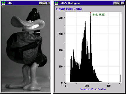
So, where the heck I am going with all this? Good question, first off, the histogram is a tool that can show you the nature of your image. For example, if we look at Daffy’s Histogram we can see that most of the bins are bunched together between pixel values 25 and 150. This indicates the image is dark and has low contrast. If the bins in the histogram had been spread out, then our image would have been a high contrast image.
Although the histogram can be very informative, it’s real usefulness shines through when we use it as a guide for changing the appearance of the image. We know that Daffy’s histogram indicates a low contrast, dark-ish image, right? So, what would happen to the picture of Daffy if we took his histogram and spread out all the bins-o-beans such that we obtained a uniform density of beans? (See below for explanation of uniform-bean-density). What I am talking about is called “histogram equalization” (Although some people call it “histogram linearization”). Now let’s see what it looks like:
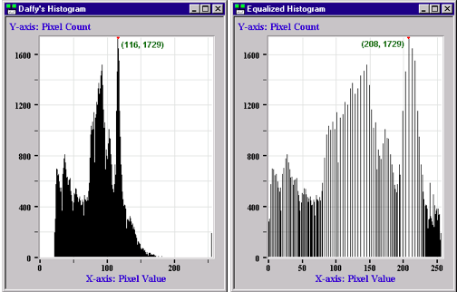
See the way the areas with the taller spikes have thinned out and the shorter spikes are still bunched together? That’s the result of equalizing the ‘bean’ density. Now let’s see what has happened to Daffy’s image as a result of spreading out the pixel values over the entire 8-bit range:
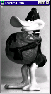
There you have it! Daffy’s image now has much higher contrast as a result of fiddling with the histogram. Isn’t image processing fun?!?
Next time, we’re going to try something else with graphs…